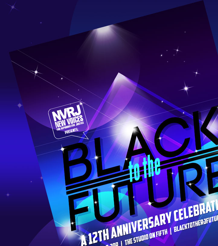
Black to the Future
Art direction and graphic design for a human rights and reproductive justice organization's annual fundraising gala.
Stanley L. Tate, Esq. is a student loan attorney based in St. Louis, MO who started his practice with the most honorable of intentions: to help people stuck and struggling with student loan payments the same way he was after receiving his law degree. In addition to being a lawyer, Stanley also happens to be a design geek--as in a true fan of design with a genuinely discerning eye. He made it clear from our first conversation that he wasn't interested in going the corporate, formulaic route for his practice's branding and website design. Establishing a distinctive, stylish aesthetic that reflected his personable approach to law was an imperative step in setting Tate Law apart from his colleagues and peers.
Also imperative--to avoid, as much as possible, using overly technical language that could potentially confuse or overwhelm the average Jane and Joe who needed his services most. I tagged in Deesha Philyaw, a talented copywriter who I worked with as Creative Director to her Managing Editor at 1839, to author the content.
The resulting tateesq.com is engaging, polished, and unambiguous in both it's look and tone. It establishes Stanley as a consummate, friendly professional striving to unburden those in debt and intentionally provides a wealth of information to this population free of charge if their financial situation prevents them from retaining an attorney.
Post launch, Stanley's pageviews increased by over 30% and the average session duration--how much time visitors spend perusing the site--increased by just shy of 44%.
Why hire huny? Let's assume you already know she's a dope designer and talk about what matters: what it's like working with her. Working with huny was super pleasurable. What I enjoyed most about her work is her ownership--she treats your project like it's hers. Every pixel had to be just right. The colors had to be just so. The design had to speak to my clients. huny did all those things. And if that were all she did, I'd be happy. But what put me over the moon was her questioning of my stated goals in the redesign and her ability to develop solutions to achieve those goals.
--Stanley L. Tate, Esq.
The scales of justice, a gavel, a crown of laurels, a courthouse: just some of the symbols readily associated with the practice of law. I wanted to avoid this kind of imagery in the Tate Law logo, initially, so it wouldn't creep into cliché territory. However, classic iconography is immediately identifiable, forthright, and can even be comforting--attributes that have a lot of value when branding a financial service for people who are in dire straits or four, five seconds away. I introduced the chess knight as a unique ingredient amongst the more boiler plate elements, and to convey to potential clients that Tate Law is strategic, mighty, and in pursuit of justice.
The line style of the logomarks were inspired, in part, by The Atlantic's colophon.
I write long content; I'm talking 2500+ word blog posts. huny developed a way for me to quickly create a table of contents that allows users to jump to sections and quickly get to the information they need. Not only is it easy for me to use, it looks damn good.
--Stanley L. Tate, Esq.
In hiring a designer, you have two goals: improving the design and increasing traffic and engagement. Since relaunching, my traffic has increased (probably due to the design and her clean coding skills) and I've had way more engagement from viewers. My contacts are up. And as result, so are my profits.
So why hire huny? The better question is: why haven't you already hired her?
--Stanley L. Tate, Esq.

Art direction and graphic design for a human rights and reproductive justice organization's annual fundraising gala.

Marketing, PR, social media content creation, graphic design, and product photography for a store representing over 200 artists located within the most prominent art gallery in the region.
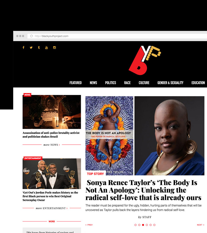
UX/UI design, front end dev, and a custom Wordpress theme for an online platform that highlights the voices, experiences, and ideas of Black youth ages 18-30.
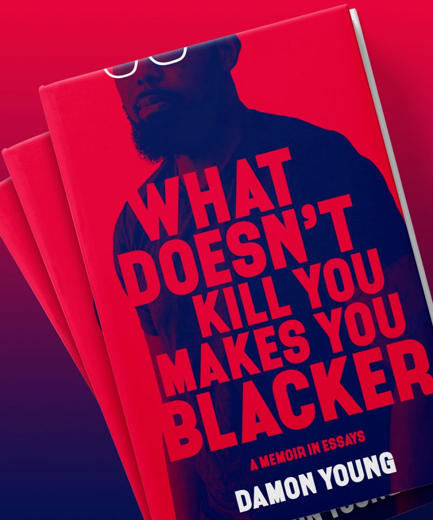
Book jacket design and author photo for the debut memoir (Ecco/Harper Collins) by award-winning writer, editor, and satirist Damon Young.