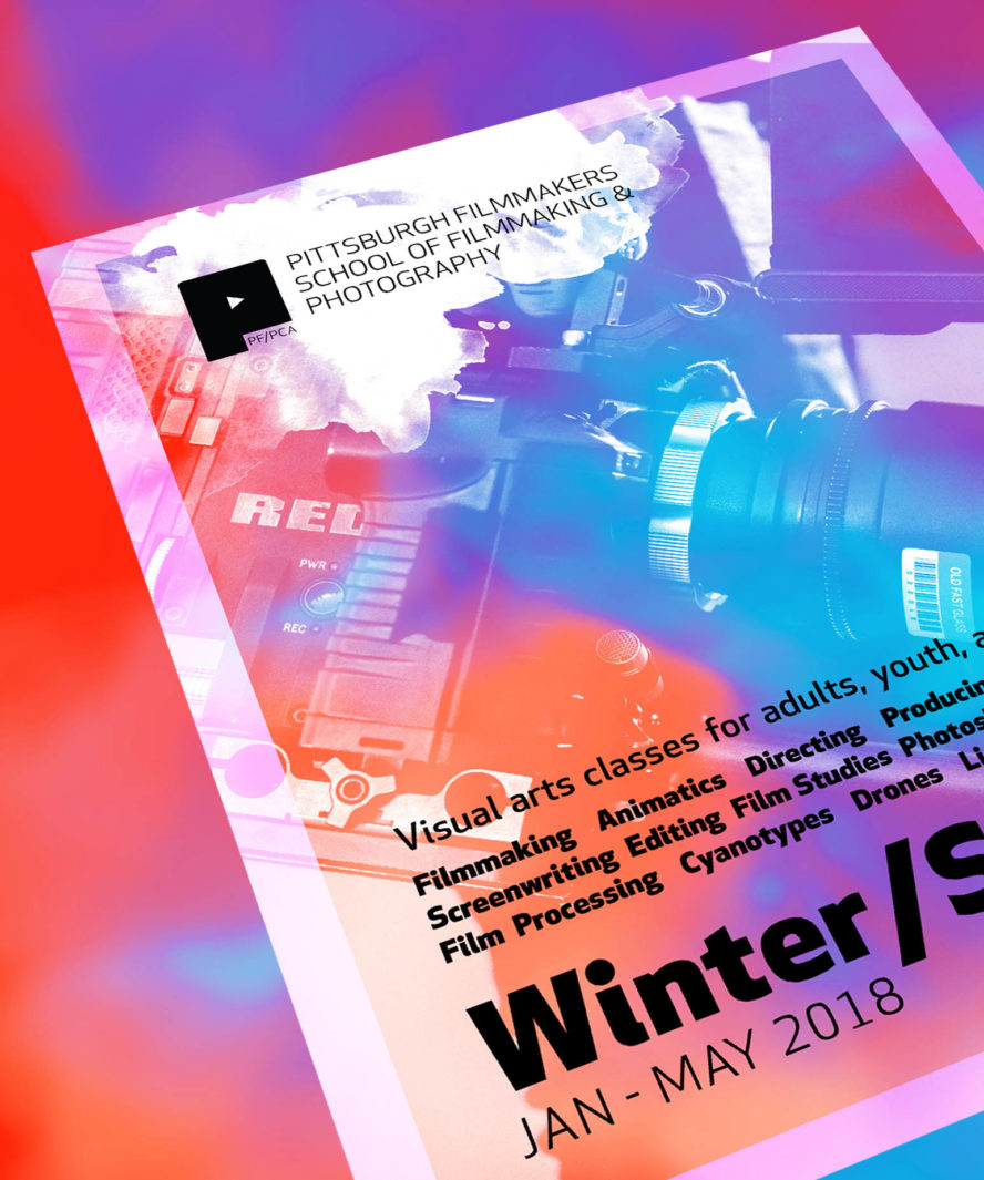
PF/PCA Education
Marketing, public relations, project management, social media content creation, graphic design, and photography for a non-profit arts organization's visual arts schools and fellowship programs.
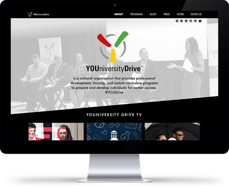
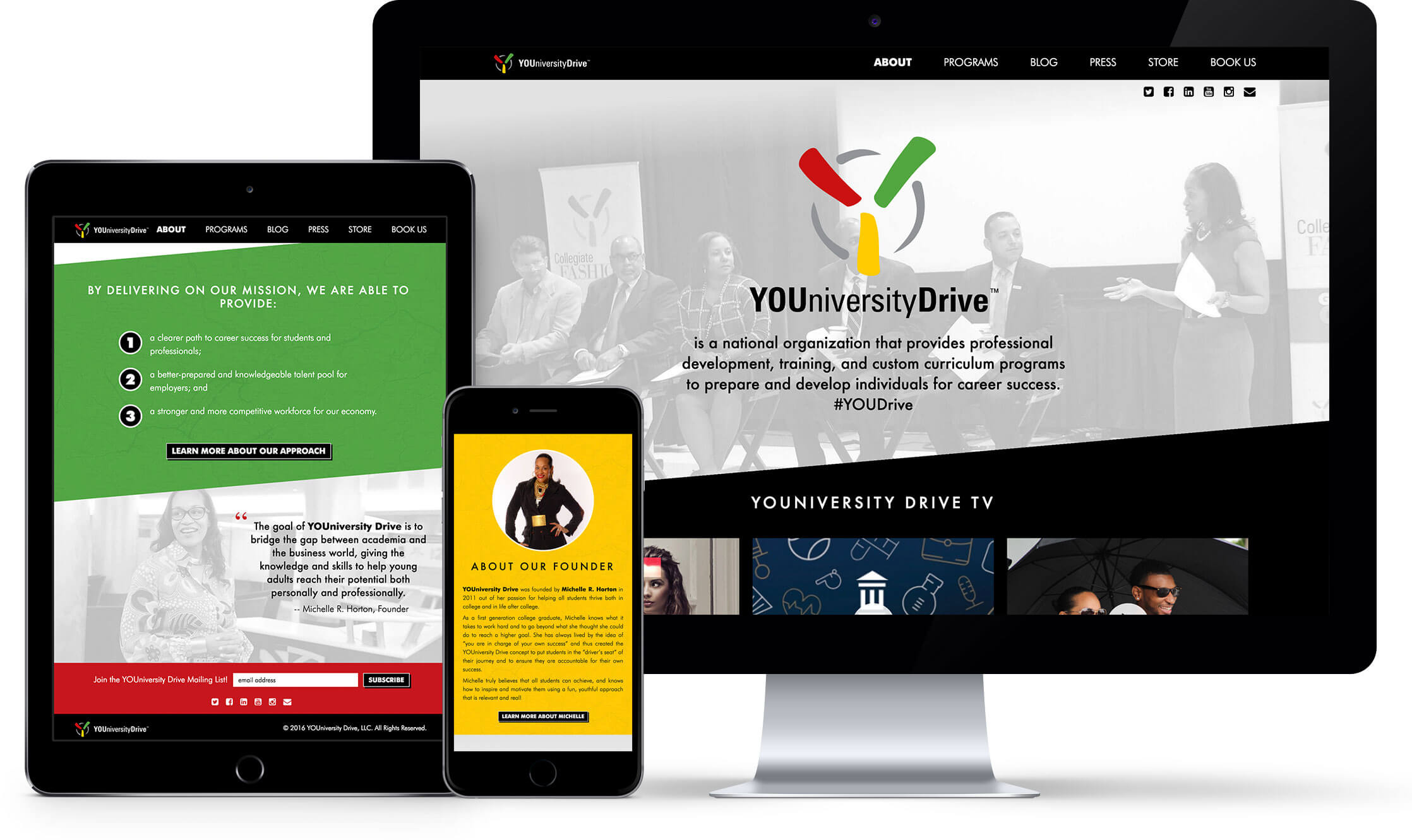
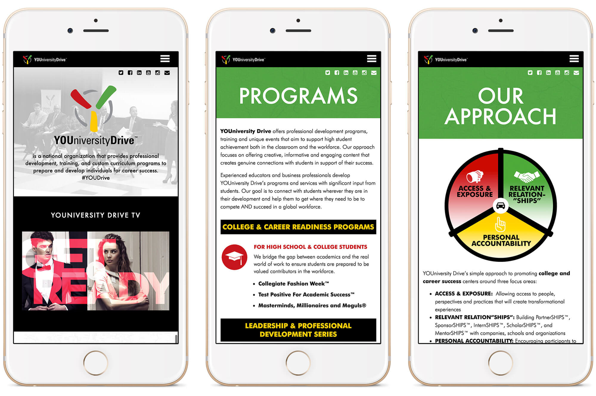
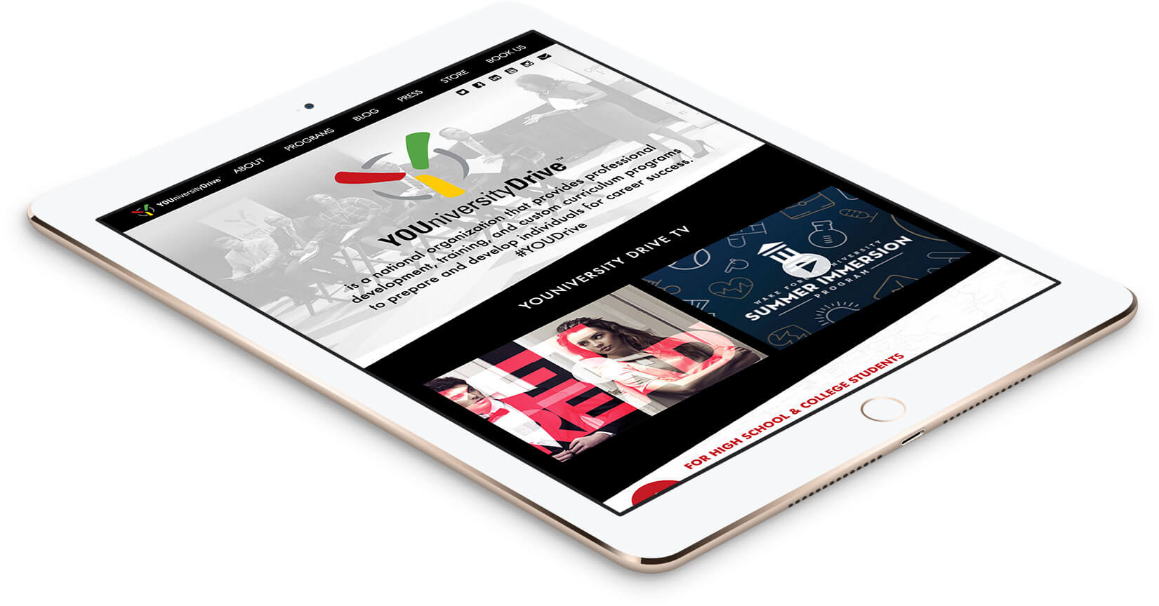
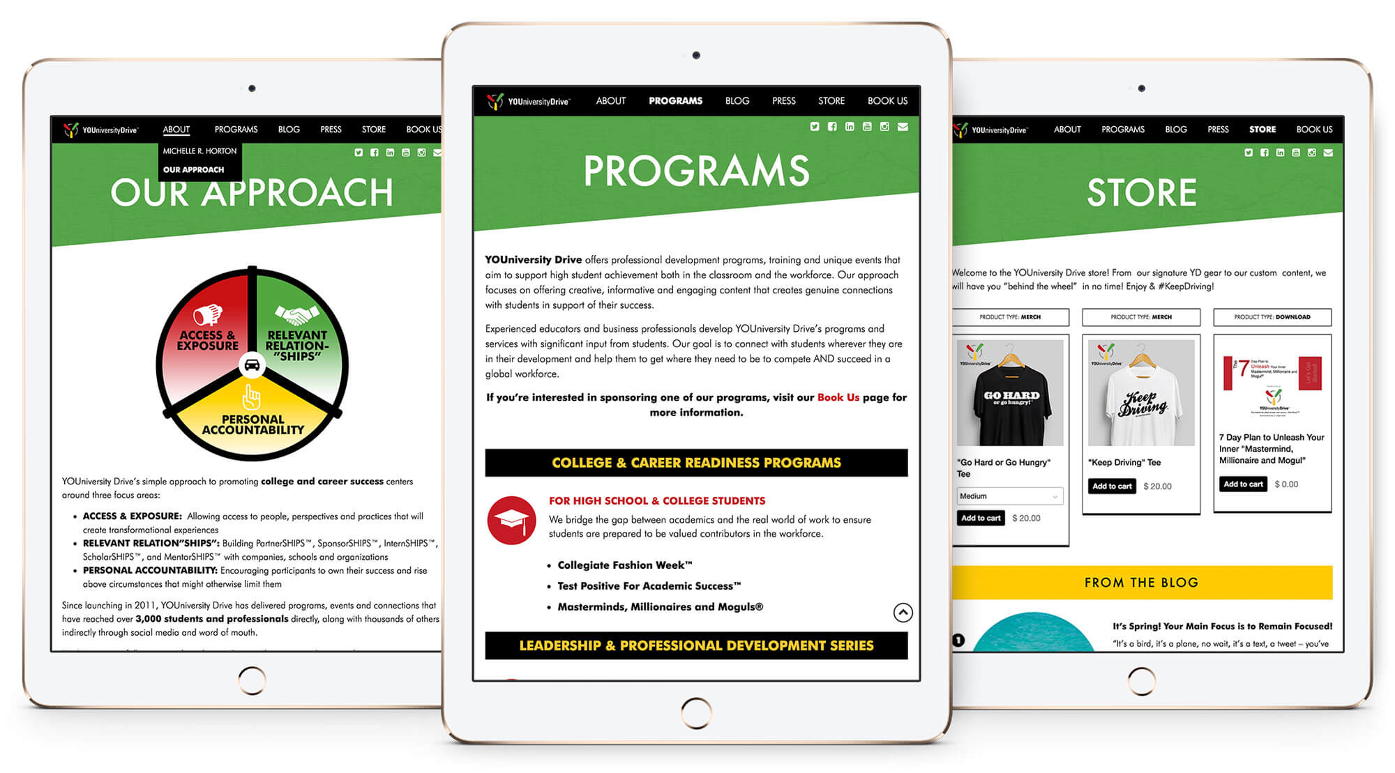
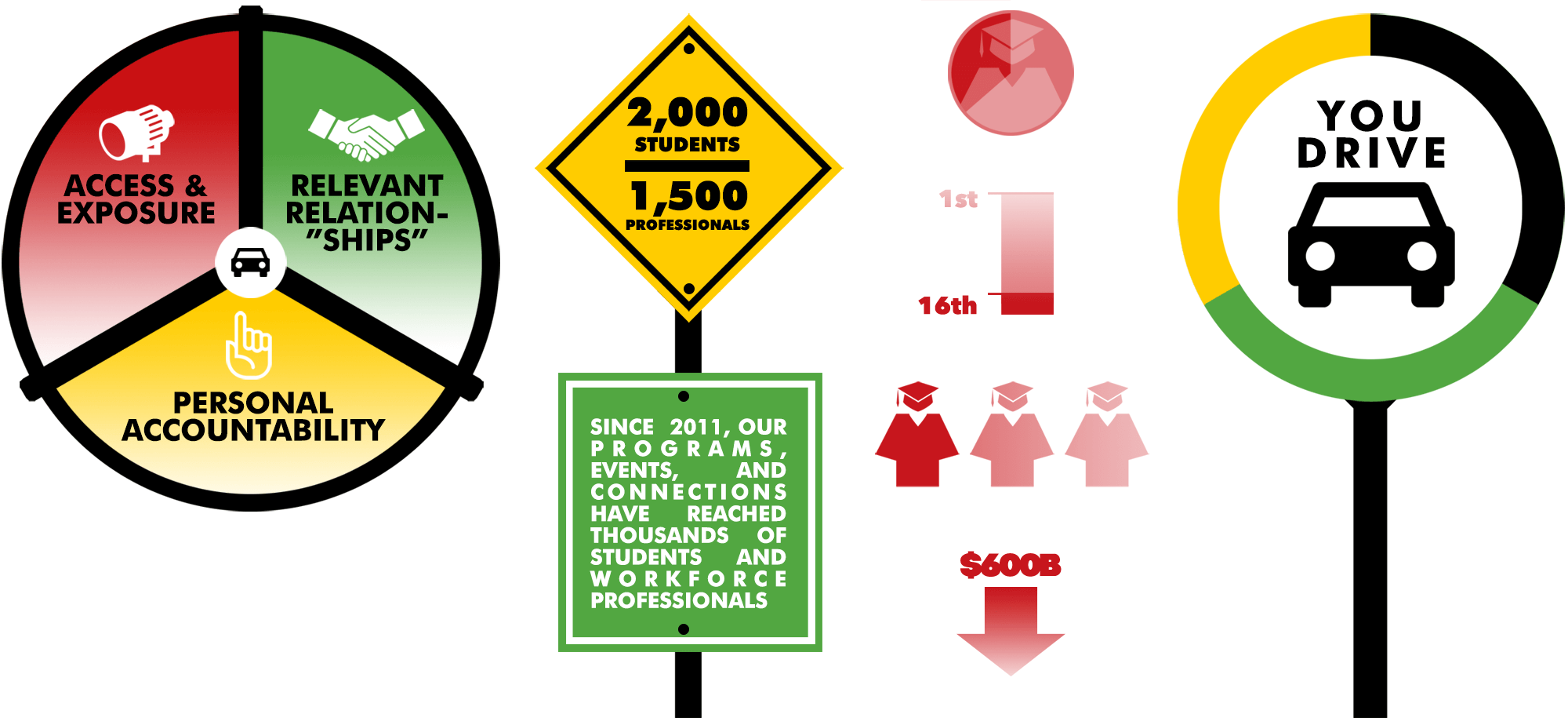
YOUniversity Drive is a national organization that provides professional development, training, and custom curriculum programs to prepare and develop individuals for career success. Founded in 2011 by educator and businesswoman Michelle R. Horton, YOUniversity Drive services both students and professionals alike by providing access and exposure, promoting relevant relationships, and encouraging personal accountability.
In Q3 of 2015, Michelle Horton and MDC Marketing Group's Michelle D. Connley-Gore concluded that while the then-current YOUniversity Drive website was functional, it failed to encapsulate the youthful energy the brand seeked to communicate. After five years in operation it was an advantageous time to reinvigorate the site design and brand direction. The Michelles, as I like to call them, selected Supreme Clientele because of my experience marrying a large amount of information in, and I quote, "an engagingly visual way (and creating a design/content hierarchy that flows)." I was particularly enthusiastic about what I identified as the biggest challenge: making a site focused on education exciting, vibrant, and interesting when so many sites in that lane feel stuffy and generic.
The primary objectives of the redesign were:
I truly enjoyed working with SCDA on my recent website refresh. Huny absolutely nailed this project! She was able to take my vision and existing content (which I had lots of) and deliver a product that exceeded all of my expectations. I could tell immediately, from our first conversation, that she sincerely cares about the success of her clients and she put so much time, thought, and energy into delivering a stellar product.
--Michelle R. Horton, Founder
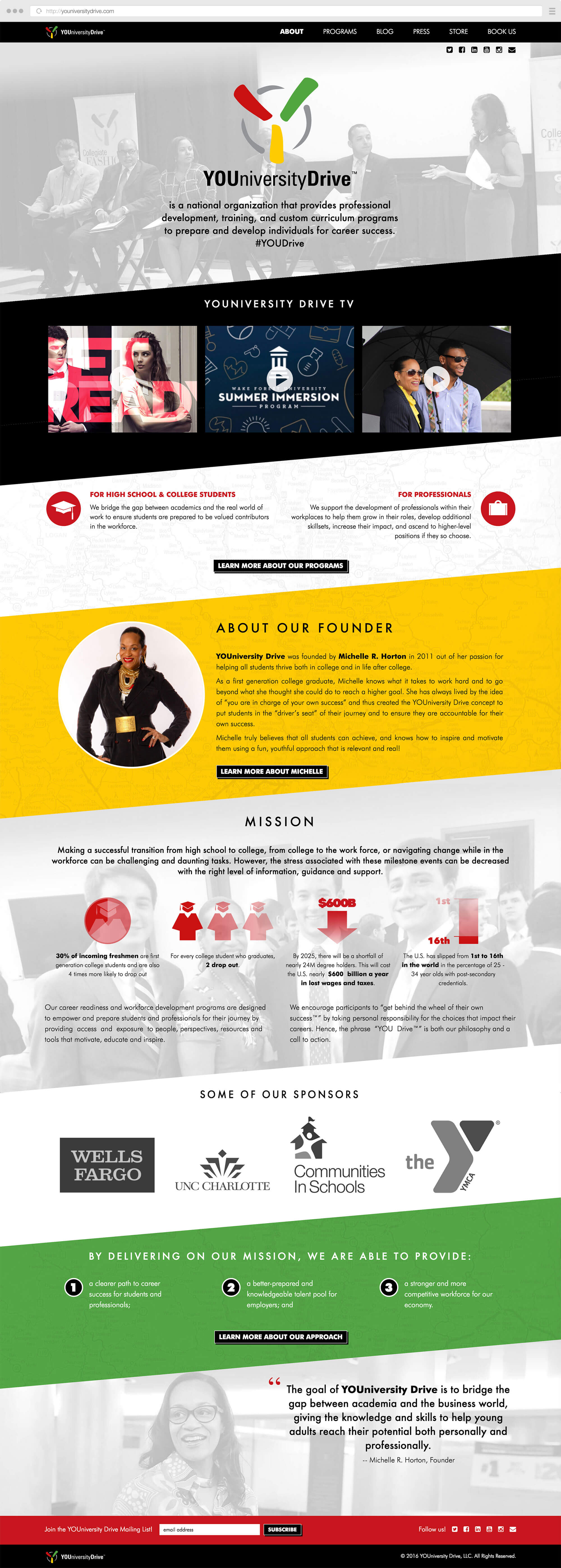
YOUniversity Drive's content was originally divided between numerous sub-pages, so a streamlined sitemap and content structure were critical for the new site. A great deal of key information was getting lost in those secondary and tertiary sub-pages. This was no more evident than in the former "about" section of the site, which housed 4 different pages of information about the organization's mission, approach, and founder. To consolidate and immediately highlight what was most important and attractive about YD, I designed a "one-page" style homepage. I employed parallax functionality to evoke movement and fluidity which would ideally keep the visitor engaged and scrolling for more.
The new YOUniversity Drive website is modern, colorful, and modular. I incorporated the already existing brand colors -- red, mustard yellow, kelly green, and steel gray -- and introduced black as an accent color. A subtle map pattern makes an appearance on the homepage's angled panels and the secondary page headers to tie in the "YOU drive" theme. Infographics and video content are utilized frequently to break up the monotony of blocks of text. And built on a Wordpress backend, The Michelles have full control over not only the copy and assets, but which custom widgets are included in the sidebar of every page as well.
Besides an incredible site, Huny also trained me on the ins and outs of WordPress so that I could be empowered to update the site without any worries, issues, or concerns. Needless to say, I am beyond thrilled with Huny's work and have received phenomenal feedback from my clients. I would absolutely work with Huny again and would recommend her without hesitation!
--Michelle R. Horton, Founder
Marketing, public relations, project management, social media content creation, graphic design, and photography for a non-profit arts organization's visual arts schools and fellowship programs.
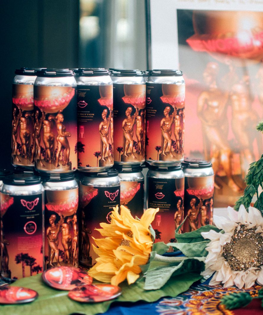
Creative direction, branding, packaging design, graphic design, photography, & promo for a craft beer collab that debuted at Fresh Fest 2018, the nation's first Black brewery festival.
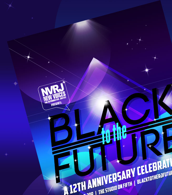
Art direction and graphic design for a human rights and reproductive justice organization's annual fundraising gala.
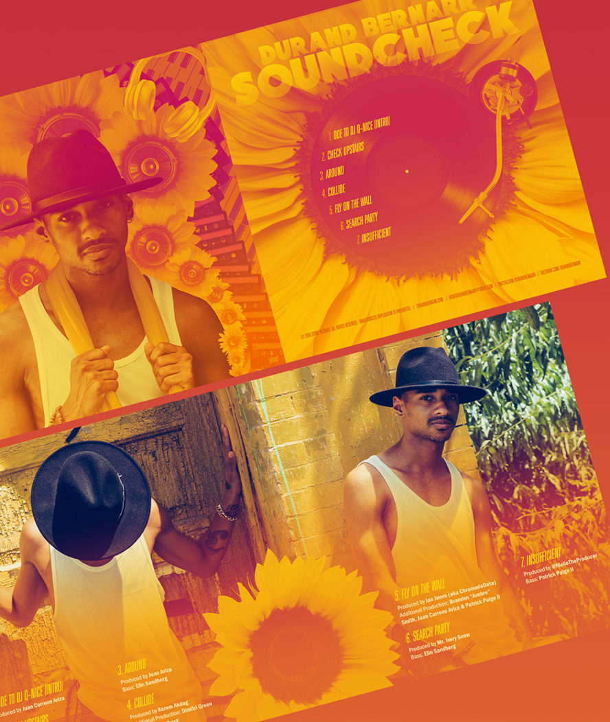
Creative Direction, styling, photography, EP booklet design, UX/UI design, front end dev, and a custom Wordpress theme for singer/songwriter and Erykah Badu background vocalist Durand Bernarr.