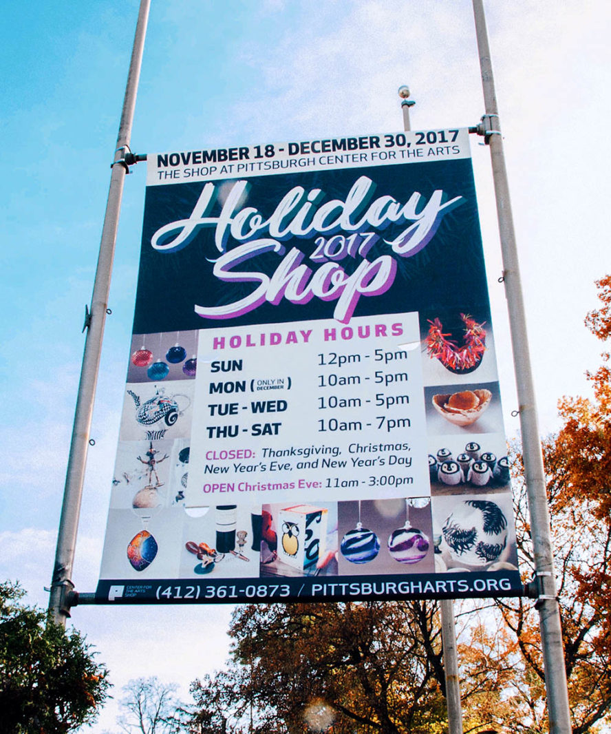
Pittsburgh Center for the Arts Shop
Marketing, PR, social media content creation, graphic design, and product photography for a store representing over 200 artists located within the most prominent art gallery in the region.
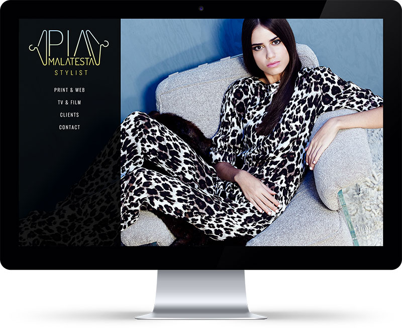
Pia Malatesta is a FIT-trained wardrobe stylist, set costumer and fashion consultant whose clients and credits include MTV, NBC, Saks Fifth Avenue, Kanye West, and Harley Davidson. Pia and I partnered up to create her official online portfolio, which needed to reflect her classic, on-trend perspective and also be easily, quickly updatable as she's primarily on the road hopping from gig to gig. Because Pia's work samples are highly visual--editorial fashion spreads, beauty campaigns, music videos, and commercials--my primary goal was to create a site design that was distinctive and sophisticated but wouldn't distract from her tear-sheets and video clips. A close second, goal-wise, was to ensure Pia and her boyfriend Finn could add to and edit the site at a moment's notice whenever their very busy schedules would allow. The new Pia-Malatesta.com runs on a Wordpress backend expanded by the Advanced Custom Fields plugin.
Pia's new logo is based on one of Finn's sketched concepts. We knew we wanted to incorporate hangers in some way, but stay away from anything that would read as cliché or heavy-handed. The resulting branding is crisp, geometrical, and, of course, quite stylish. The black, powder blue, and pastel yellow palette communicate New York, LA, and Miami simultaneously.
Stylists, by trade, devote their time to creating looks based on their clients needs and dictations. It's perhaps because of this that their portfolios tend to be very minimal and lack personality. What I appreciate about working with Pia is her commitment to communicating her own aesthetic, which sets her far apart from her contemporaries. The new Pia-Malatesta.com proves that clean, classic design doesn't have to be at all boring or cookie-cutter.
Pia was very much drawn to the varying font sizes and colors that tag clouds employ, so we reflected that look on her clients page. Whereas a tag's styling in a tag cloud is based on it's frequency of use, the styling of Pia's client names randomizes--thus there's no set hierarchy. Alternately, the "level" of any client can be individually, manually set within Wordpress and instead of randomizing it will maintain its styling.
Pia was very clear in wanting a lightbox effect on her photo and video galleries. Simple, clear navigation from asset to asset was a must. On any devices, from desktop to mobile, once a photo or video is launched in a lightbox "pop-over," the visitor can browse next (or previous) without ever closing the lightbox effect. Ideally, this functionality encourages longer interaction with the site.

Marketing, PR, social media content creation, graphic design, and product photography for a store representing over 200 artists located within the most prominent art gallery in the region.
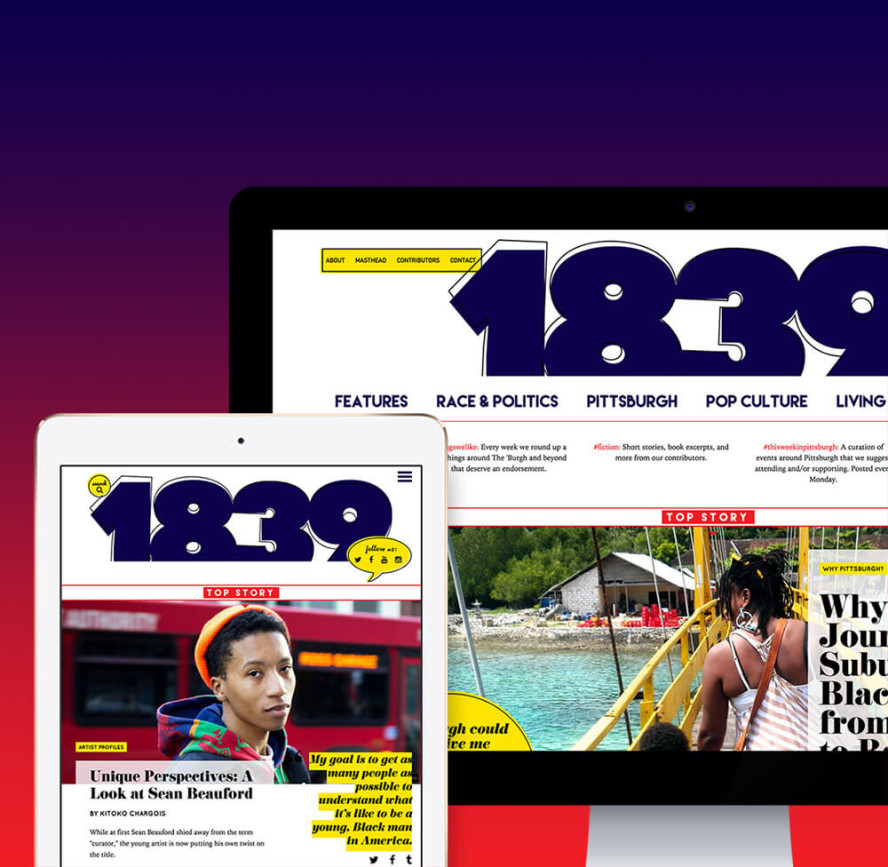
Creative direction, photography & photo editing, social media management, UX/UI design & dev, identity, branding, and custom WordPress theme for a Pittsburgh-based Black arts and culture magazine.
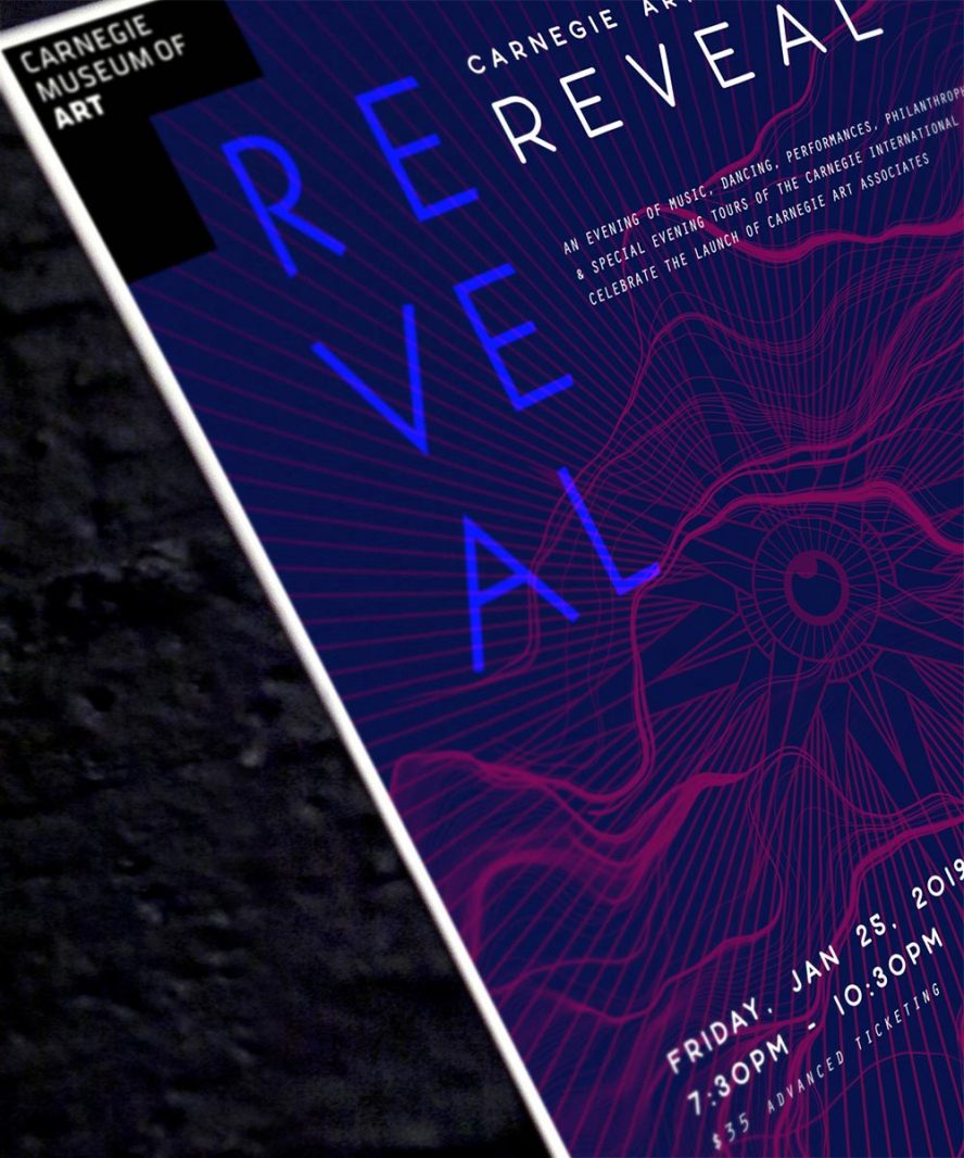
Marketing, PR, consulting, and art direction as an executive board member for a new membership and programming tier at Carnegie Museum of Art.
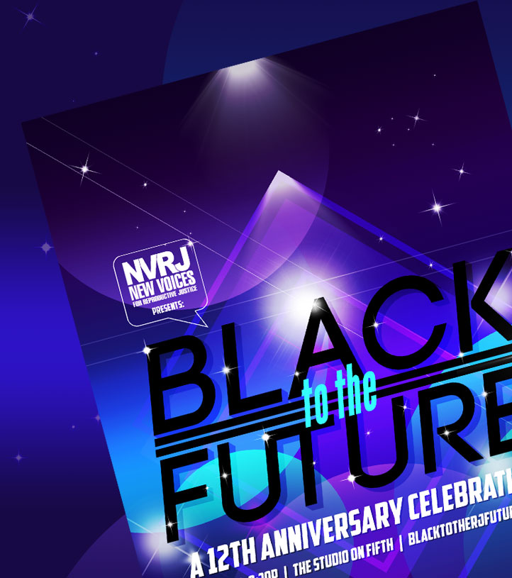
Art direction and graphic design for a human rights and reproductive justice organization's annual fundraising gala.