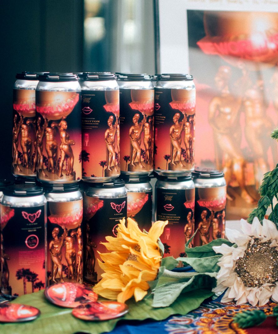
The World is Ours
Creative direction, branding, packaging design, graphic design, photography, & promo for a craft beer collab that debuted at Fresh Fest 2018, the nation's first Black brewery festival.
Very Smart Brothas was founded in 2008 by Damon Young and Panama Jackson as a relationship blog with a humorous perspective. The site quickly gained popularity as a daily stop for anyone seeking a witty and insightful approach to dating, pop culture, and race. Averaging 10,000 unique visitors a day, 450 comments per entry, tens of thousands of social media followers, newspaper, radio, and TV features & appearances, a best-selling book, and a web series pilot, an expansion of their online entity was a natural progression.
Upon Young receiving a grant from Heinz Endowments in early 2014, I was hired as Art Director to guide the design, development, and re-launch of the newly minted "VSB." From one entry a day and the most basic of Wordpress templates to a multiple-article, multiple-contributor platform, it was a sizable challenge, but the result has been very well received and widely praised.
Note: I did a slight remix/redesign in May of 2015 to make the site responsive and retina display-optimized.
Huny was my first and only choice last year when thinking of an Art Director to lead the aesthetic vision for my magazine. Having worked with her for over a decade, I was very familiar with her work and her status as a web design visionary. She has not disappointed, creating a brilliant custom layout that has received raves from readers and users alike. Not only would I recommend her Huny any design-based projects, I'd question the decision-making of someone who didn't.
--Damon Young, EIC
The day the new site launched, the "Blackest Name Ever" Tournament also debuted. This tourney was classic VSB-fare--humorous, tongue-in-cheek, and culturally specific to the core audience. The graphics I designed to accompany the tourney did their part to introduce the new VSB aesthetic and promote the #blackestname hashtag on social media.
The original VSB redesign received a lot of compliments from VSB's notoriously fickle but loyal audience. However, as the site continued to evolve and I observed the users' browsing habits, it became apparent that certain sections could use more shine and others should be phased out (RIP Rollcall). I decided that a "remix" was necessary. The homepage saw the biggest changes, including expanding the top stories section to house 5 articles instead of 3. I also added responsiveness and retina-optimization site-wide. I still do like the previous look, but I always aim for the best user experience possible and the current layout is a testament to that.

Creative direction, branding, packaging design, graphic design, photography, & promo for a craft beer collab that debuted at Fresh Fest 2018, the nation's first Black brewery festival.
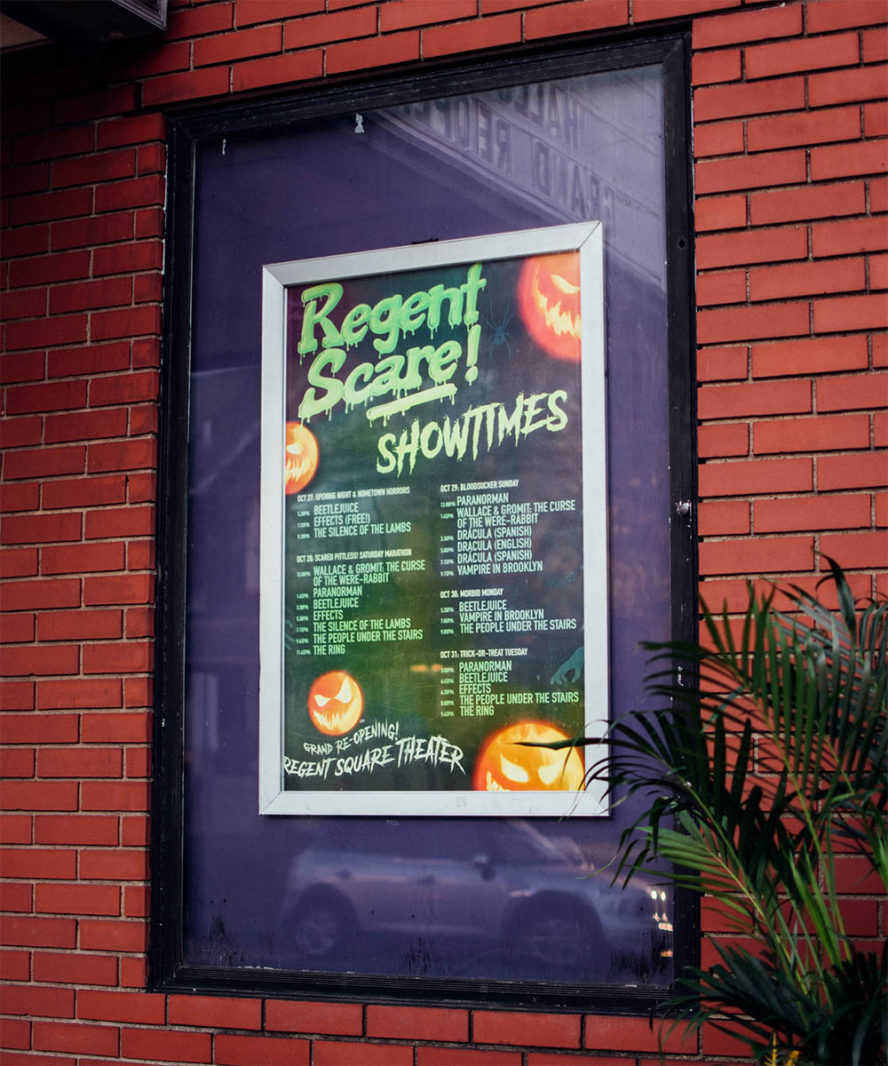
Marketing, public relations, copywriting, social media content creation, graphic design, photography, and videography for an non-profit arts organization's cinema program.
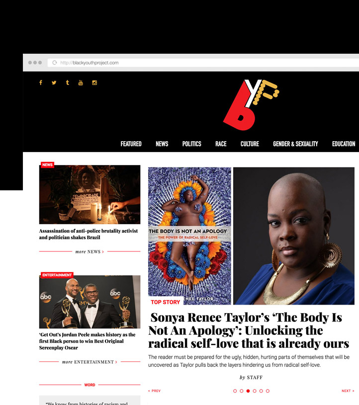
UX/UI design, front end dev, and a custom Wordpress theme for an online platform that highlights the voices, experiences, and ideas of Black youth ages 18-30.
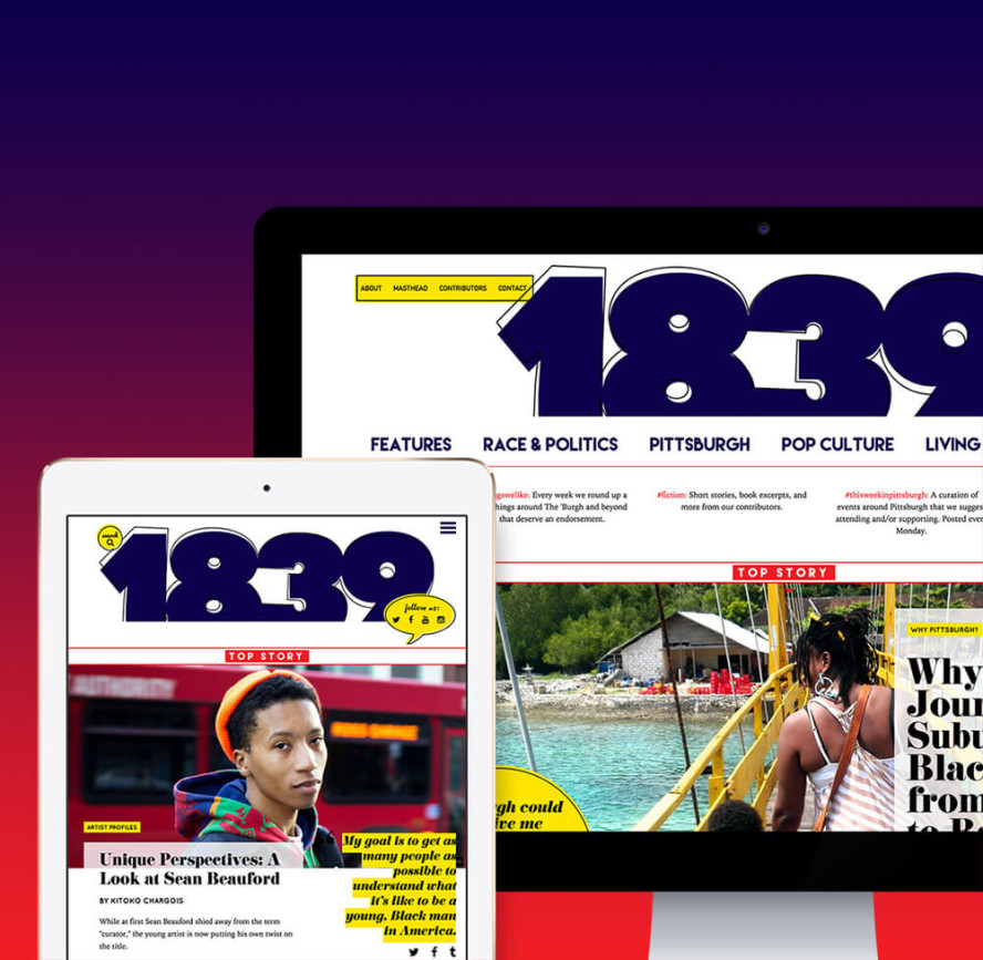
Creative direction, photography & photo editing, social media management, UX/UI design & dev, identity, branding, and custom WordPress theme for a Pittsburgh-based Black arts and culture magazine.