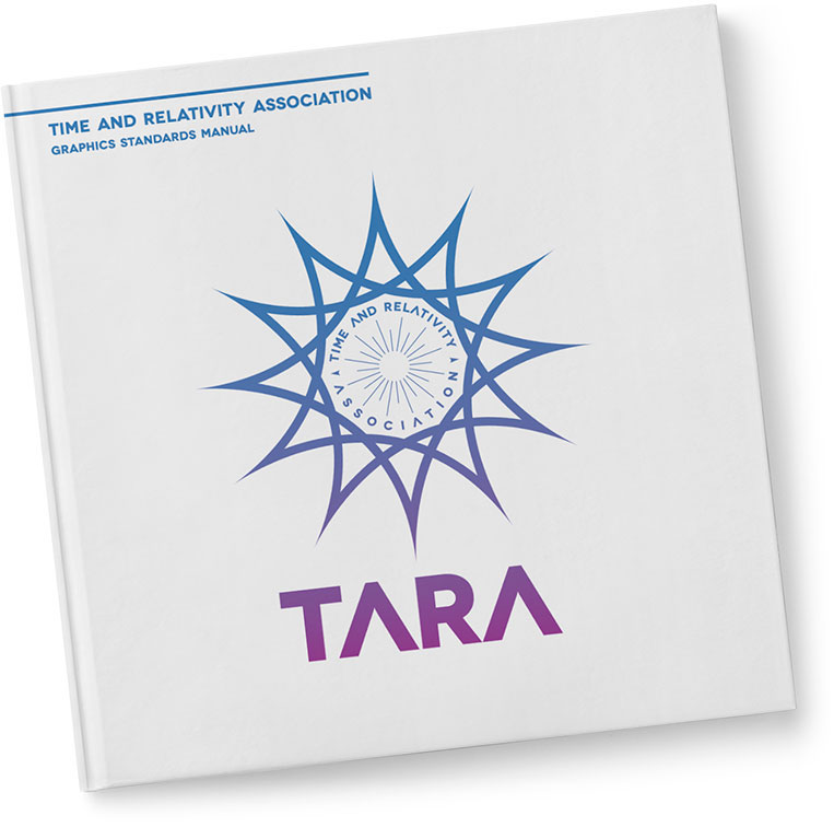
Welcome to the reissue of Time and Relativity Association's Graphics Standards Manual (.pdf). The identity system presented herein was used to maintain the visual integrity of TARA's brand in all marketing and communications materials, as well as to create new initiatives to expand the civilian audience's awareness of TARA's mission. Before time travel efforts for civilians were frowned upon and the scientific breakthroughs that made it possible were considered a triumph of mankind, TARA's aesthetic approach encouraged simplicity and consistency in order to build trust and comfortability. Although the TARA program was decommissioned in 2025 due to what's come to be known as "The Incident," the branding and identity guidelines remain a fascinating part of history for designers and more.
Note: This was a special project I created while interviewing for Google's Visual Design Team in the summer of 2016. After this project I interviewed on-site at Google HQ in Mountain View, CA. The design exercise was as follows:
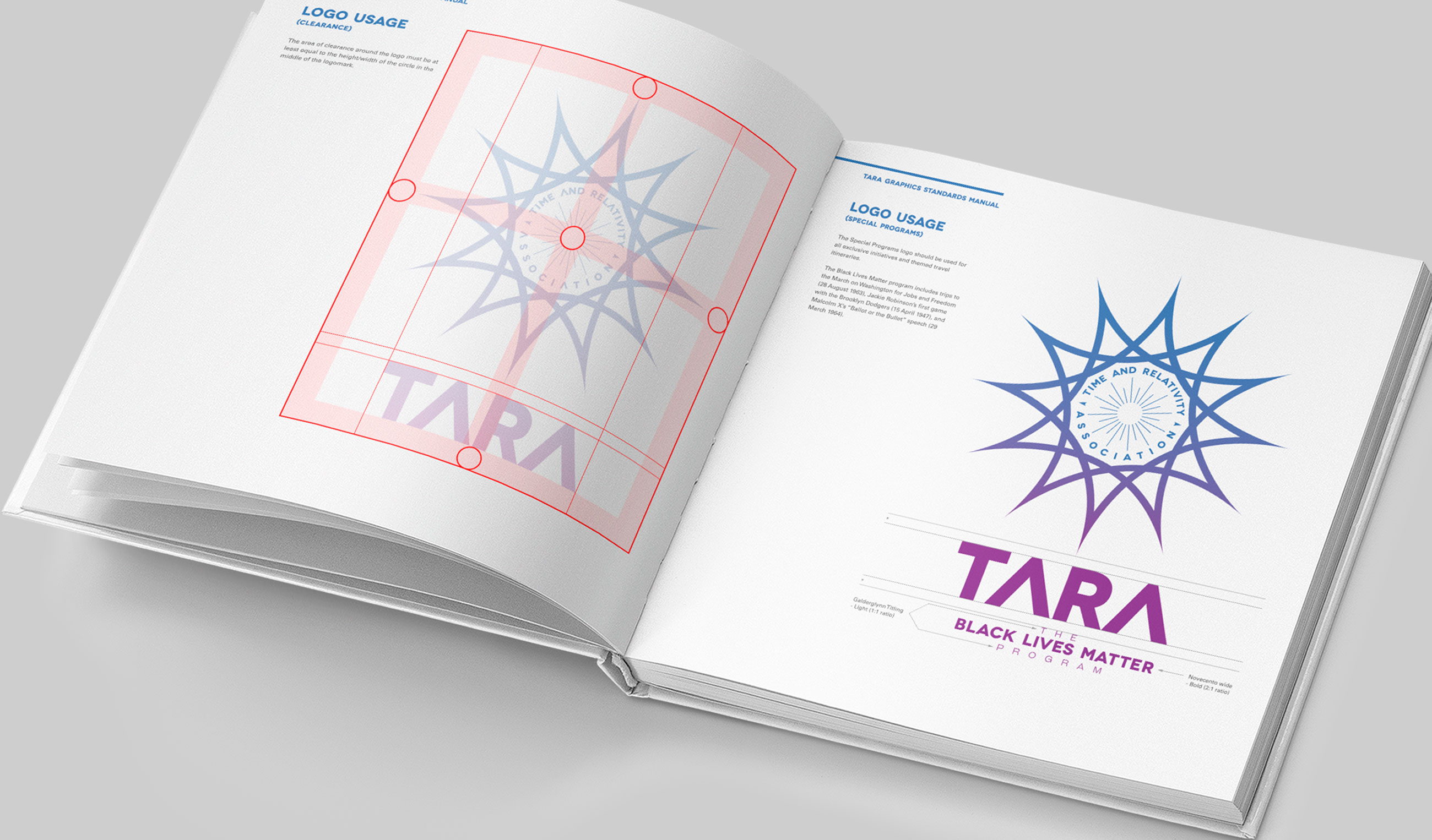
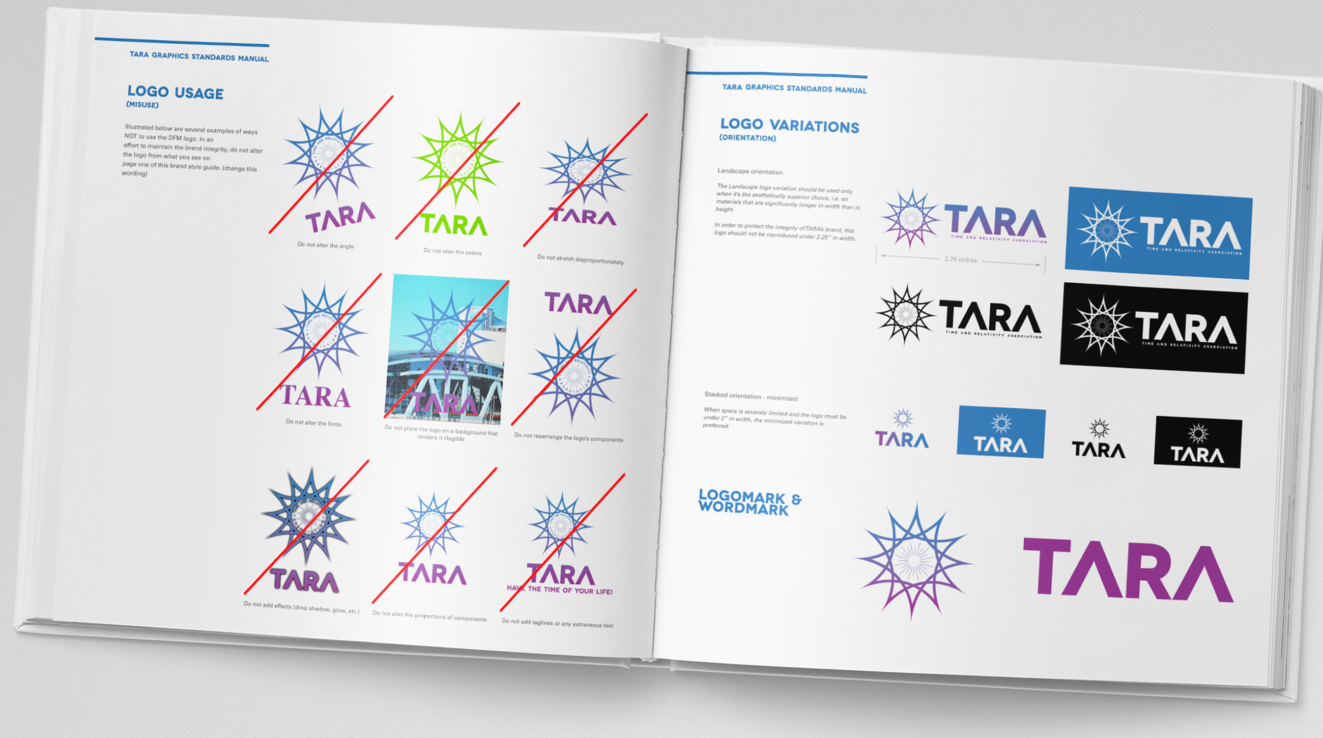
The government is developing a new consumer time travel program to be called TARA (Time And Relativity Association), which needs to speak to the civilian audience. Develop an identity system for TARA that establishes its brand. Prepare a guideline that demonstrates how this brand can be universally applied, including some environmental examples such as a logo in a cockpit, or on a ray gun. Make sure that proper use, and misuse examples are clearly documented.
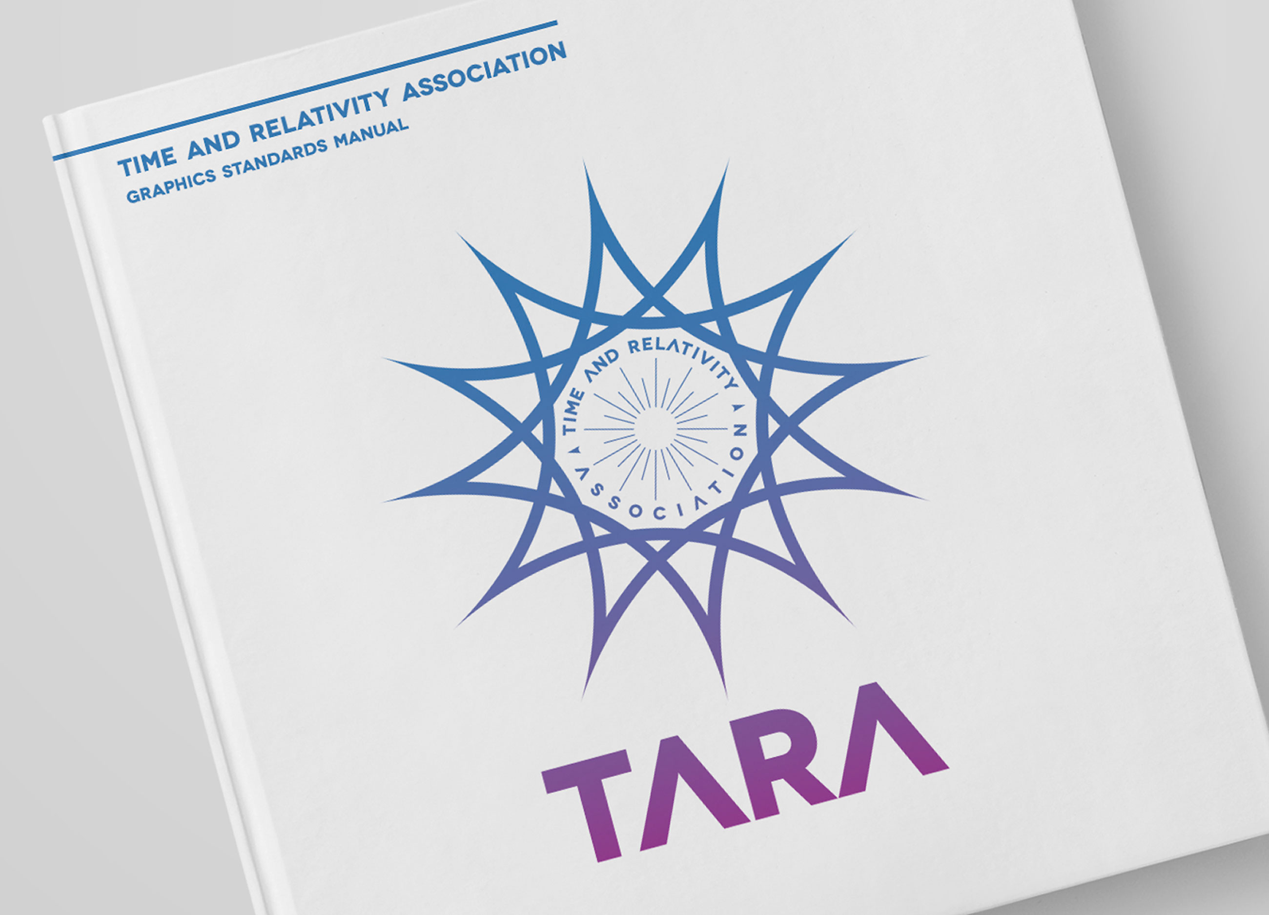
TARA's branding, specifically the logo, or "the sunburst", was the first crucial step in gaining the confidence of the civilian sector. Time travel was still a hard to explain and abstract concept to most people and it was also widely unattainable due to the price.
TARA's first set of talking heads and scientists were rather unapproachable and used language that flew over a lot of heads--your average person didn't know much about wormholes or the Self-Consistency Principle or the speed force. I felt it was important, then, to keep the logo more simple than complex, and to convey movement and boundlessness. The sunburst itself has no end or beginning point--it is its own infinity symbol. And the wordmark was a direct homage to NASA's "worm" logo. NASA is a brand that people trust and have nostalgia for, and we wanted TARA to follow suit in that respect.
--sarah huny young, TARA Creative Director (2016 - 2020)
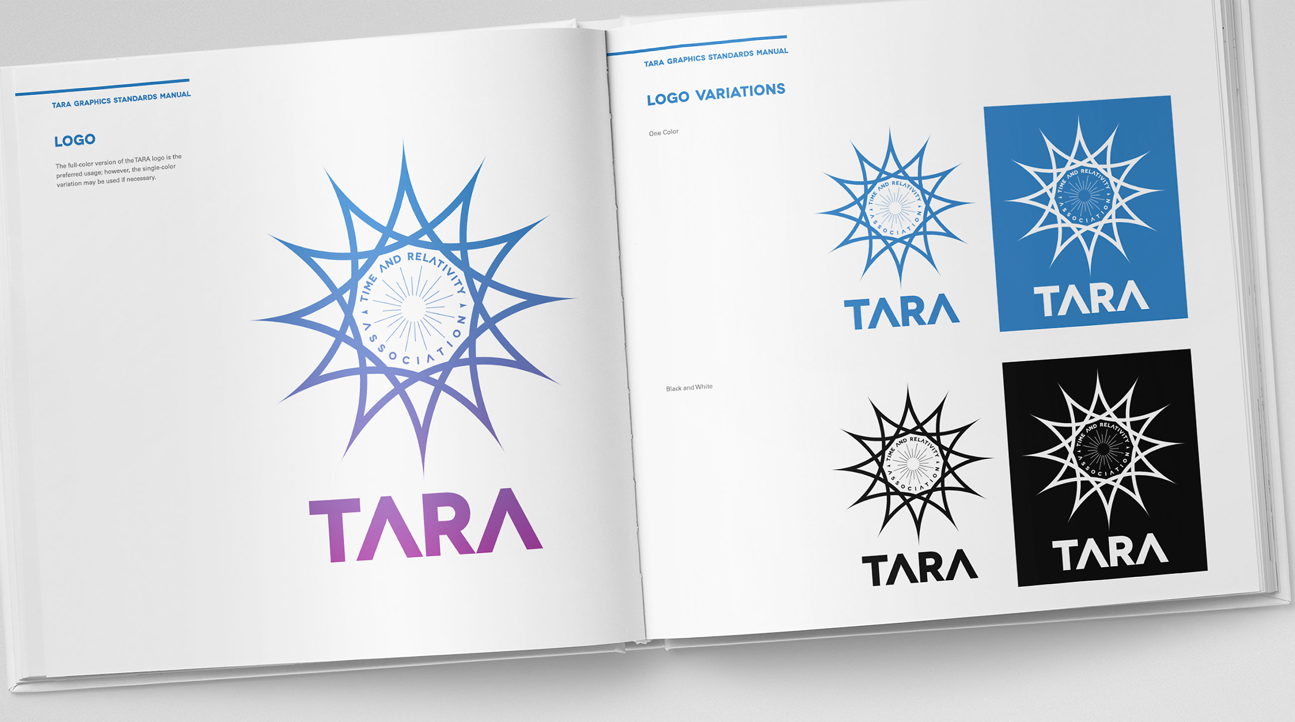
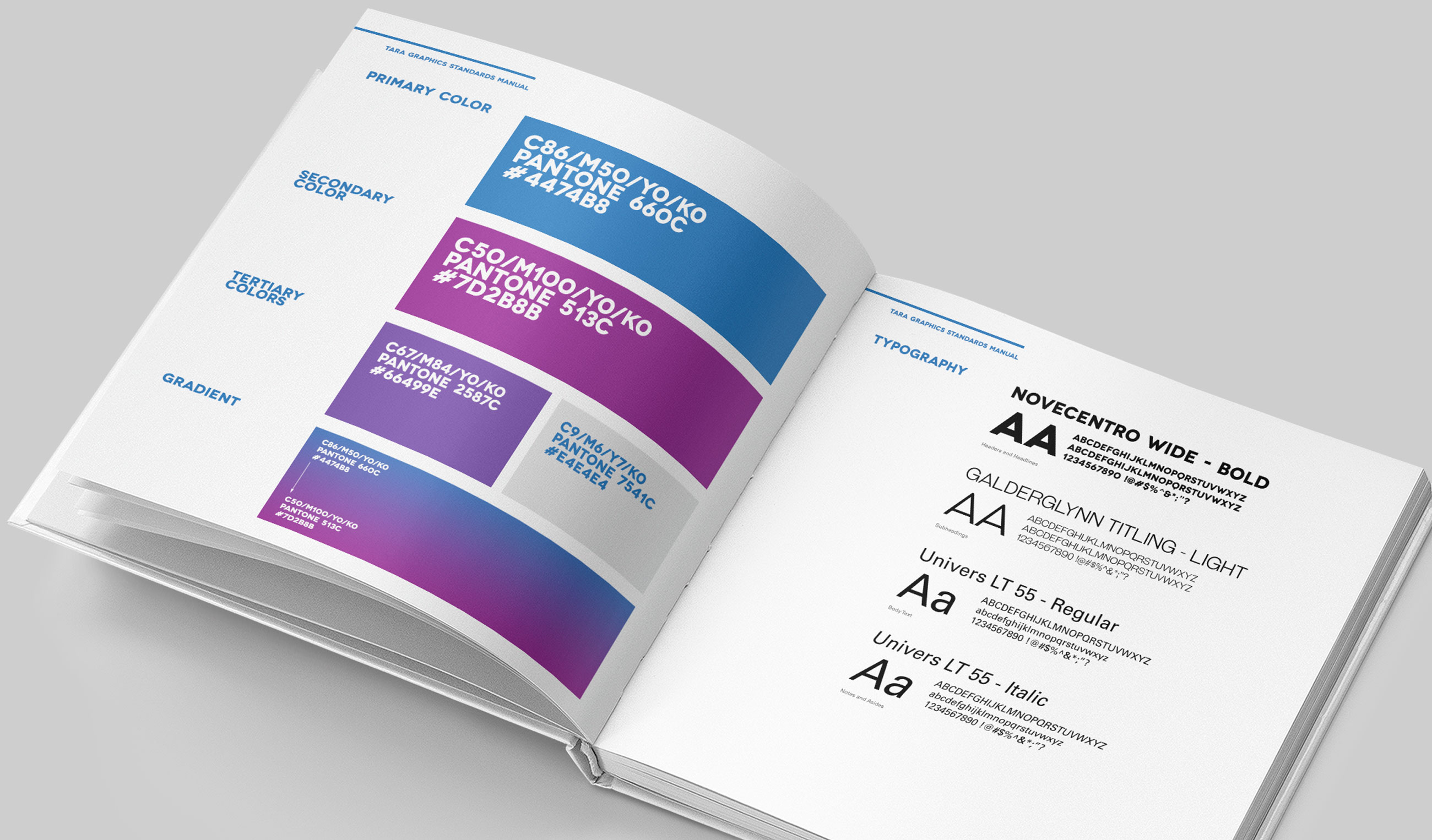
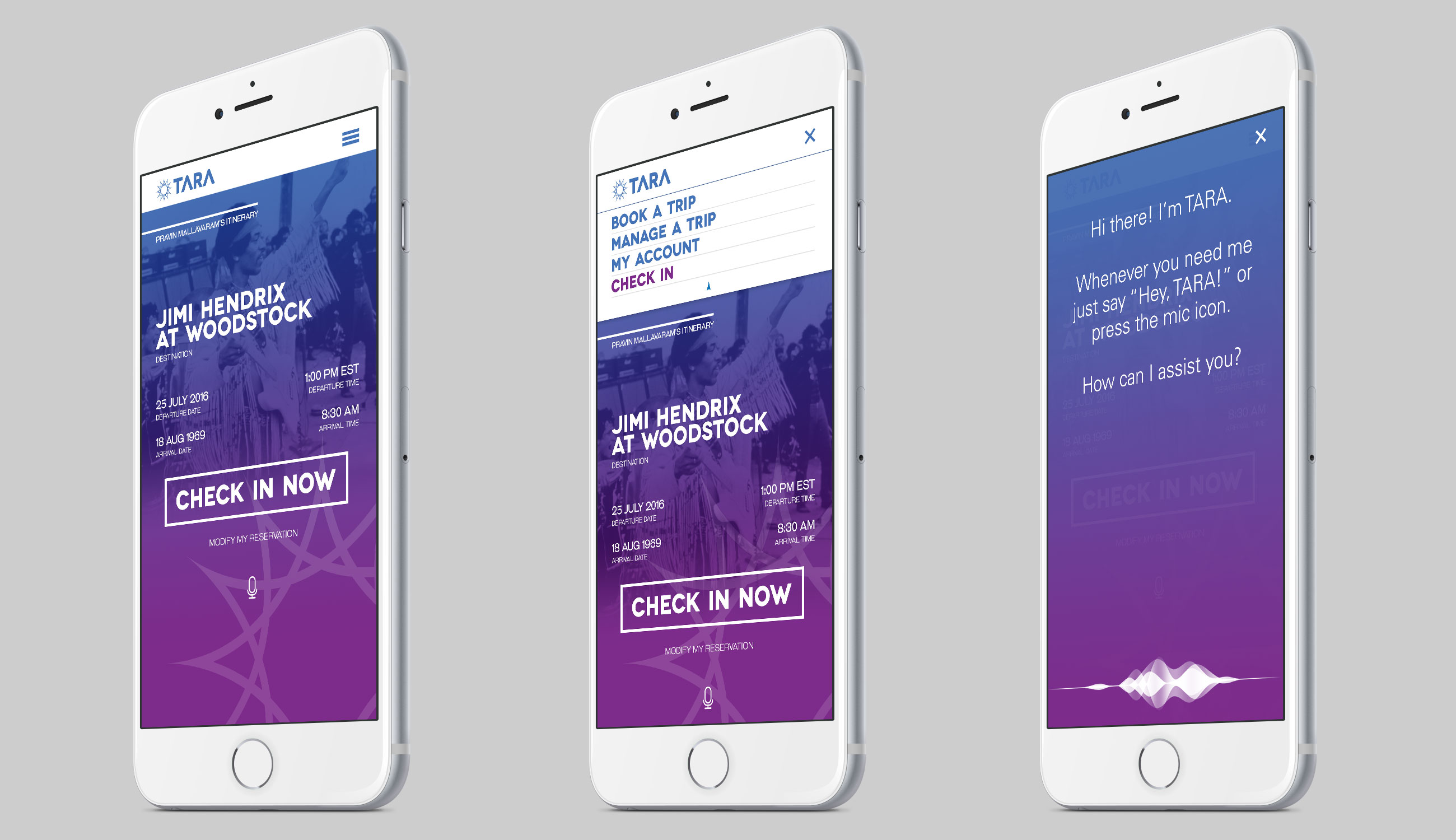
TARA's color palette was very intentional. The Mediterranean blue communicates integrity, tranquility, and trustworthiness--most financial institutions and medical companies choose blue as a part of their color scheme for this reason, too. And the magenta/purple conveys wealth and sophistication. TARA was, after all--despite trying to appeal to the everyday Joe or Jane--a luxury brand. Finding the balance between the approachable and the exclusive was paramount.

Before the TARA logo most of us are familiar with from our youth, there were several iterations that were quickly discarded. For the first time in history, these sketches are available for perusal as part of the TARA Graphics Standards Manual reissue with commentary from TARA's former Creative Director sarah huny young:
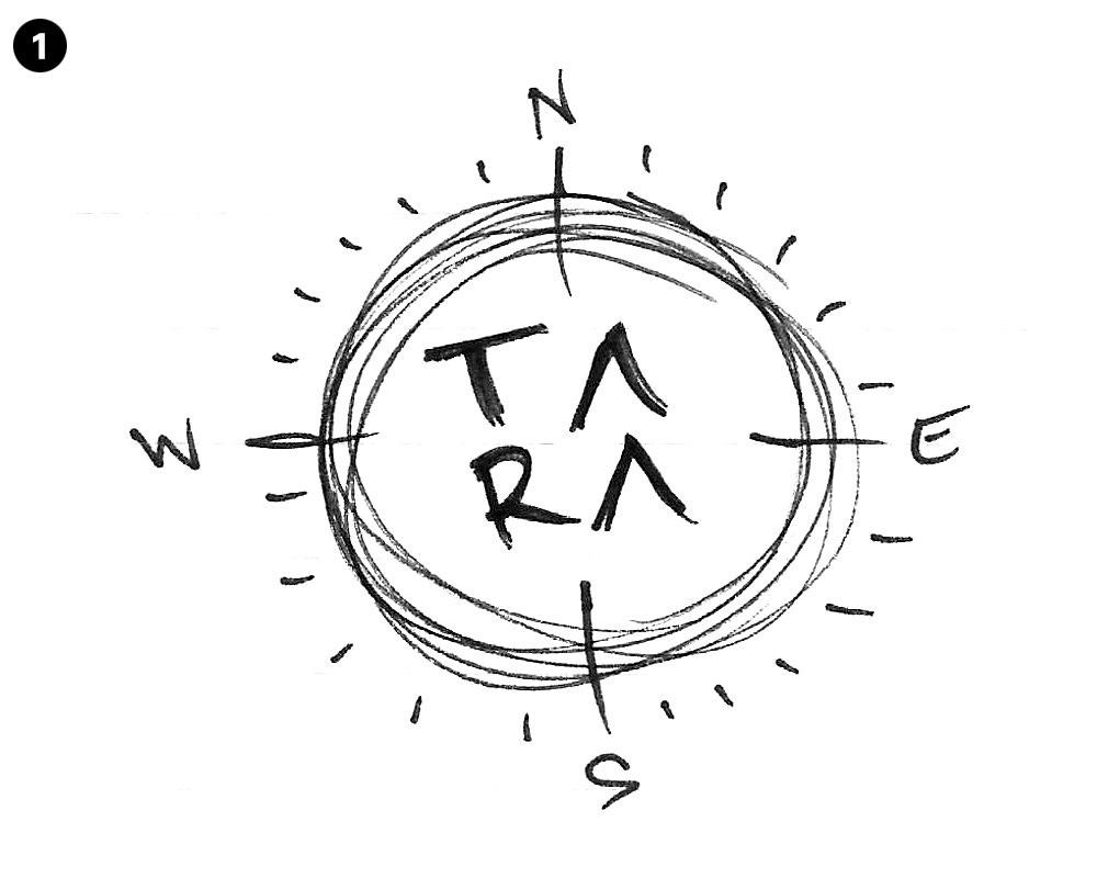
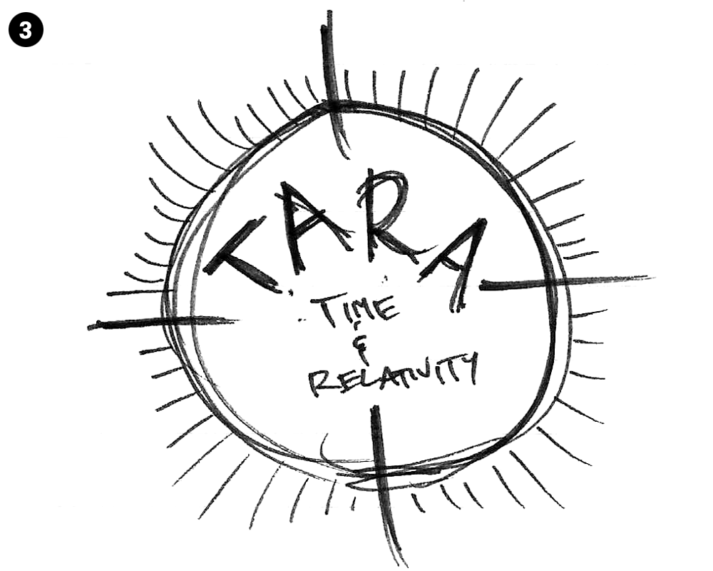
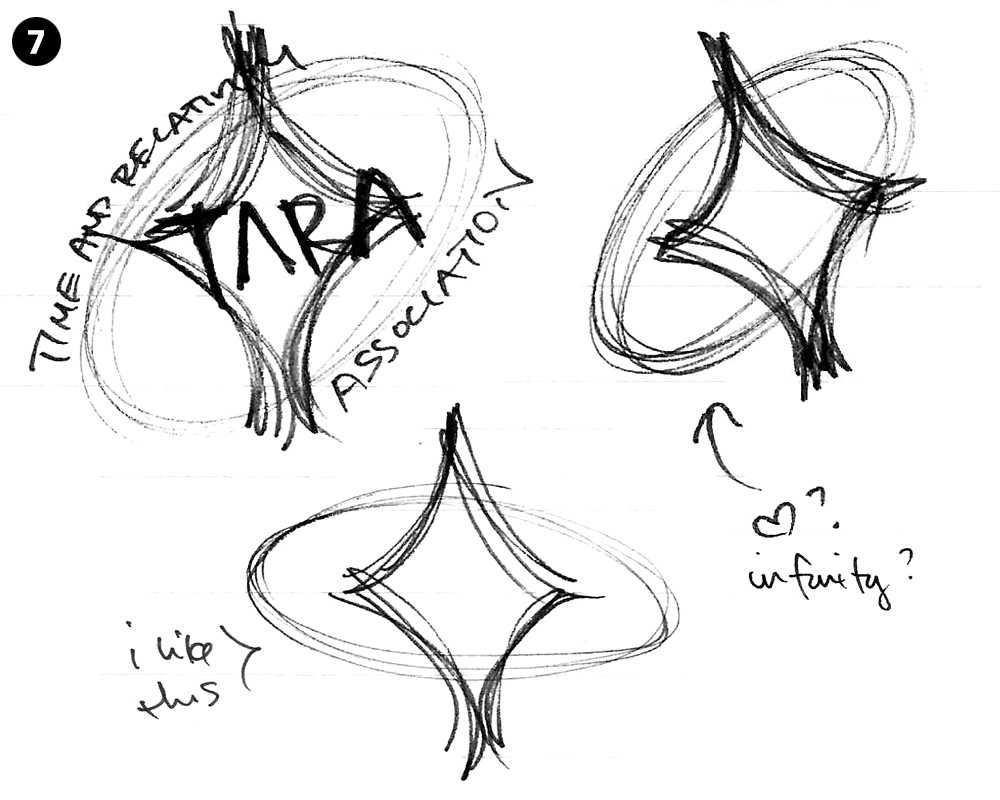
"My first immediate thought when I sat down to sketch a logo for TARA was a compass. Although my next immediate thought was how predictable that was (as well as nonsensical considering time travel is not directional), I still began to draw a few out to hopefully jog my inspiration (fig. 1, fig. 3, fig. 6). And as evident from even my first sketch, I was adamant about removing the cross stroke from the letter As. That's something I've always liked about the NASA logo and it just made sense to me visually. It feels technologically sleek.
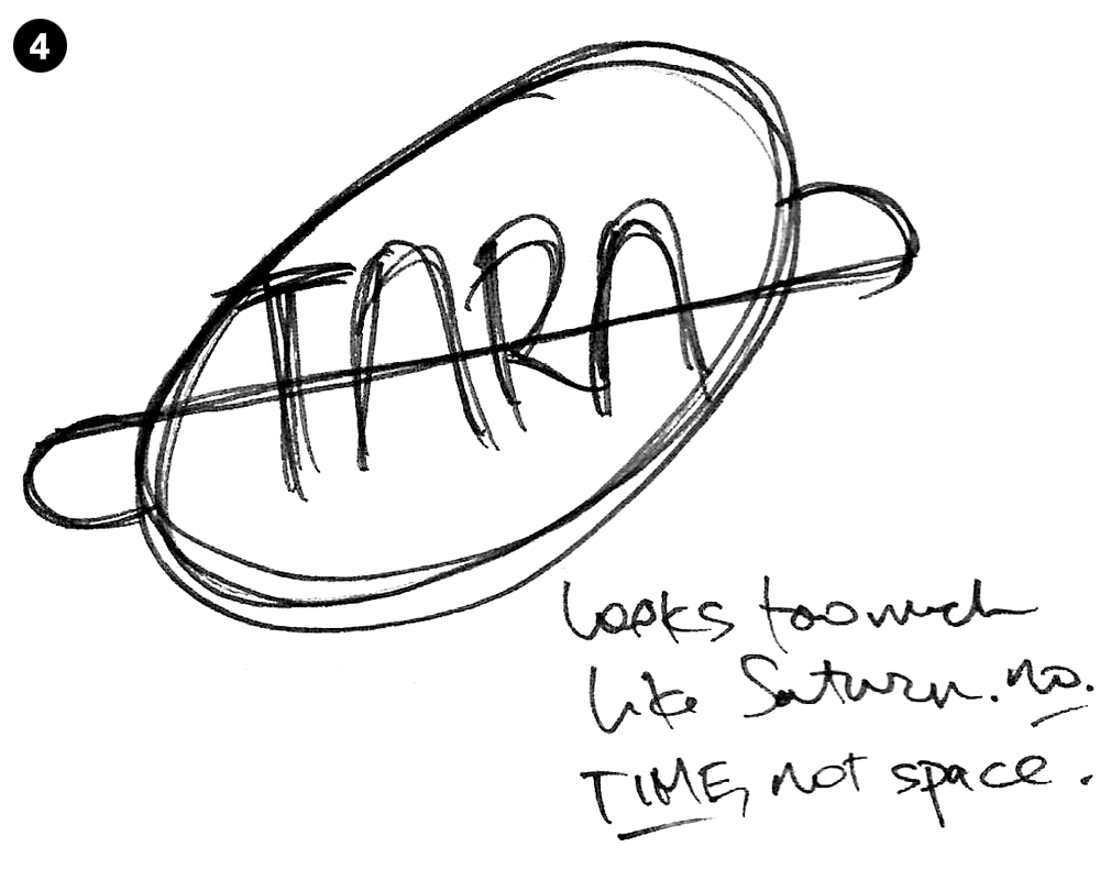
In fig. 4 I began considering a visual reference to Salvador Dali's melting, abstract clocks in his seminal "The Persistence of Memory" painting. I didn't want my oval shape to be asymmetrical, though, and I didn't want to draw on any clock hands either. Again: too expected, too much of an insult to people who don't need such an obvious visual clue. And the shape quickly started to resemble Saturn as well--I had to correct myself several times: it's time travel not space travel.
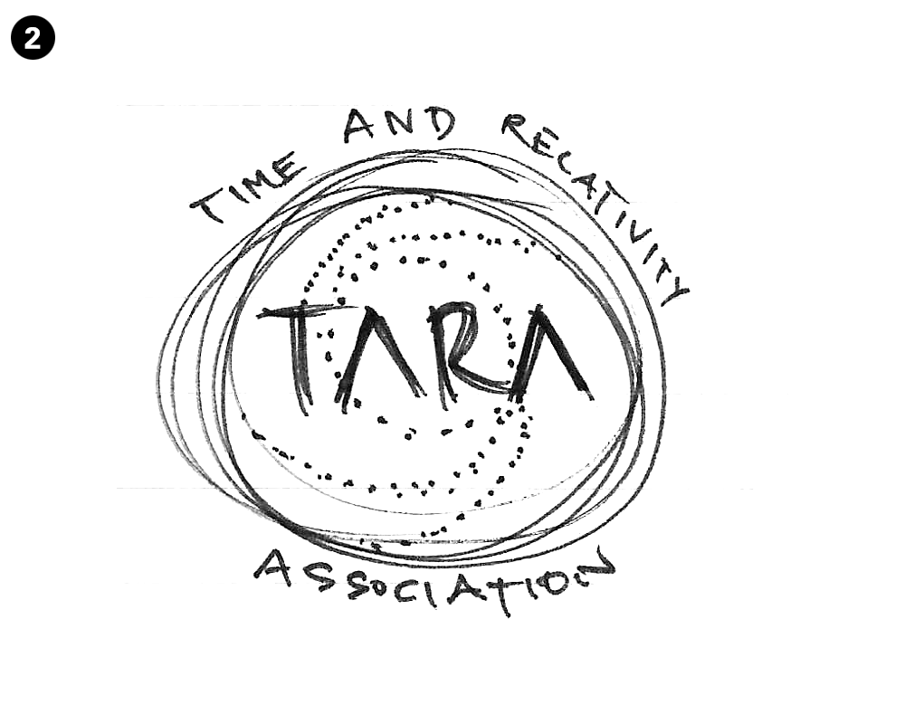
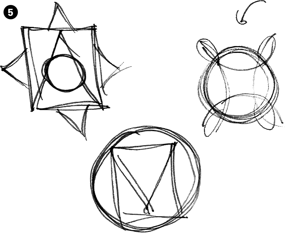
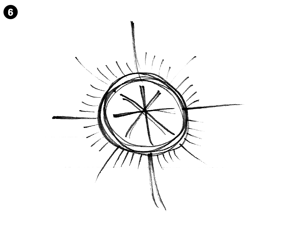
Fig. 5 was when it started to click. I began to sketch several random shapes overlapping each other or looping into each other as a reference to the concept of multiverses. This practice resulted in a shape with a lot of potential (in fig. 5 and again in fig. 7 I literally drew an arrow at it). I didn't quite know what to do with it yet, however, so I drew one last compass (fig. 6) just to make sure I wanted to abandon that POV altogether. This last compass sketch actually resulted in a simple little starburst that spoke to me and incorporated into the final work. I then returned to the shape I liked to angle it 45 degrees, remove the loops and isolate the shape inside--a superellipse. This shape, multiplied and overlapped symmetrically, became the most prominent element in the completed TARA logo."
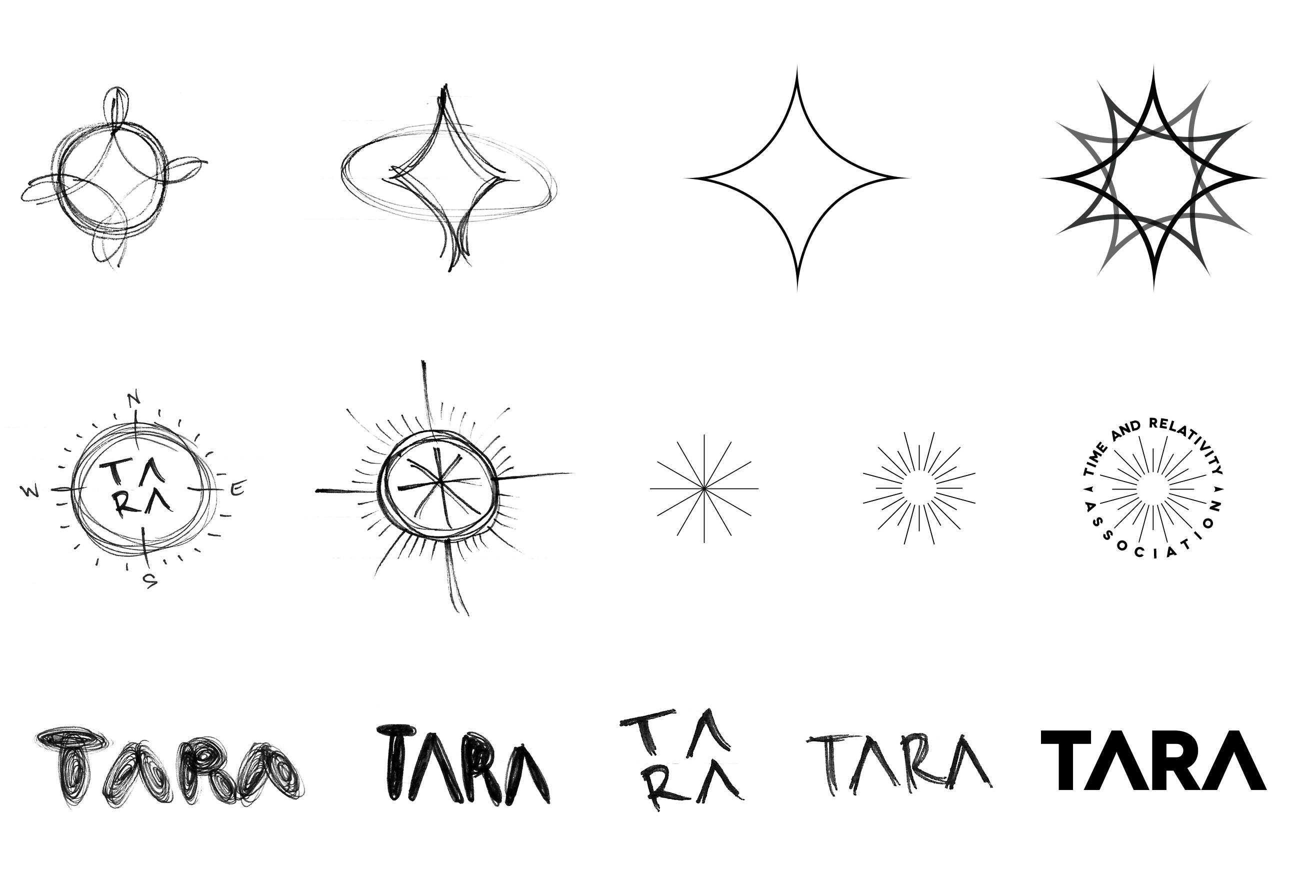
If you stare at the TARA logo long enough, particularly if you isolate one superellipse after another, it begins to look like it's actually spinning on it's own axis. This seems extremely apropos given Einstein's Theory of Relativity which deals with gravitational pull and acceleration, and states that time exists in tandem with matter and space and they come into being simultaneously.
--young
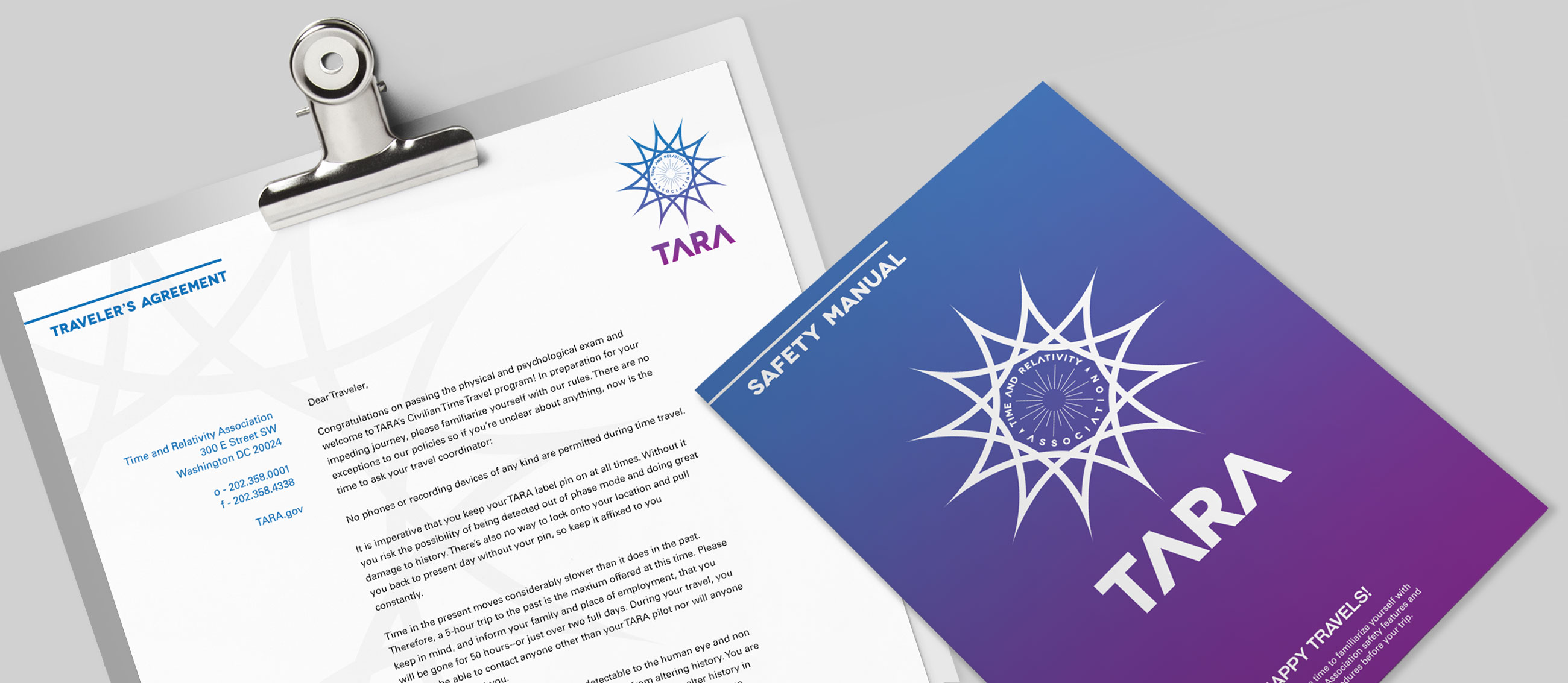
Time travelers had to agree to adhere to a specific set of rules that might've been more of a bitter swallow were they not presented in beautiful and intriguing packaging. First they were required to pass a physical and psychological exam. Additionally, no one was permitted to stay in the past for over five hours, which translated to roughly 48-50 hours in their original timeline. Travelers also weren't permitted to take any phone or camera devices with them to record anything. And most importantly, all time travelers had to wear a TARA-issued pin on their person at all times. This pin's purpose was twofold: 1. it was a "beacon" that allowed TARA engineers to pull the traveler back into the present when their time was expired (or if something went amiss, which, as we know, it eventually did) and 2. to keep the traveler's body "phasing" and thus invisible and non-corporeal which would ideally eliminate the chances of altering the timeline.
References:
- Novikov self-consistency principle via World Heritage Encyclopedia
- "Speed Force" via Wikipedia
- NASA logo evolution: meatball vs worm via Logo Design Love
- The Psychology of Color in Marketing and Branding via Help Scout
- "The Persistence of Memory" by Salvador Dalí via MoMA
- Superellipse via Thinking Machine Blog
- General Theory of Relativity via The Physics of the Universe
- Theory of Relativity via All About Science
- Is time travel possible? via NASA Space Place
Hours put in: approximately 30. Thank you, Google.